Of all the real estate market data that Amy reported last week, the decline in median home prices in Glastonbury really grabbed my attention. To quickly recap, the first quarter of 2009 saw 33% fewer transaction (43 vs 64), and a 19% decrease in median home price ($310,000 vs $382,500). Only 4.7% of the transactions were distressed properties (the lowest of all the towns).
Glastonbury had held up quite well relative to other towns in the 2008 Year End Wrap-Up and subsequent detailed report, so learning that its median price had declined more than any other town in the first quarter of 2009 was very surprising.
Why did the median price fall so much? Is it something quirky with the mix of homes that sold or have prices really fallen that much?
Analyzing median prices is an easy way to generalize home prices, but is not a perfect metric. It relies on the distribution of transactions to remain consistent over time. For example, suppose that in 2009 owners of entry level homes sold at the same rate as they historically have, but owners of more expensive homes were much less likely to sell. This would upset the historical distribution of sales by overweighting the entry level homes and underweighting the more expensive properties. The effect would be a decrease in the median home price of the town’s transactions.
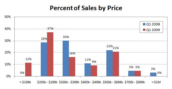
The above chart looks at the transactions on a percentage basis rather than in absolute numbers. This helps compare the two periods since they have very different numbers of transactions. It is interesting to see that most of the differences appear in the under $400k categories. The first quarter of 2009 had 14% fewer sales in the $300k – $399k range, but 8% more in the $200k – $299k range and 12% more under $200k. The upper price ranges are roughly comparable, though 2009 results are slightly less in each price band.
Looking at the distribution of sales prices is a good start, but is not the complete picture. Who’s to say that homes selling in the $300s last year are not comparable to homes selling in the $200s this year? One way to begin addressing that question is to compare the size of homes sold this year versus last year. Larger homes typically sell for more than smaller homes.
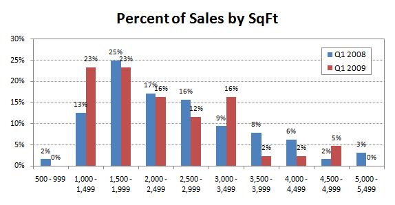
Again, we look at the percentages of homes sold to normalize the two periods. The data breaks up into three groups for me – I see overweights in three of the red 2009 results followed underweights.
1. The 2009 overweight in the 1,000 – 1,499 range is followed by underweights in the next three ranges.
2. The 2009 overweight in the 3,000 – 3,499 range is followed by underweights in the next two ranges.
3. The 2009 overweight in the 4,500 – 4,999 range is followed by underweights in the largest range.
This chart clearly shows that the homes sold in the first quarter of 2009 were smaller than those sold in the first quarter of 2008, which helps to explain why the distribution of prices moved lower and the median price was lower.
Looking at real estate using statistics is an imperfect science. There is data available, but because only a fraction of the homes in a particular town sell each year, we always need to evaluate the results with a critical eye. In this case, the 33% decrease in the number of Glastonbury transactions is definitely real. However, I believe that the 19% decrease in median home price overstates the weakness of the market. The homes that sold in the first quarter of 2009 were noticeably smaller than those that sold in the first quarter of 2008.
Keep your head up, Glastonbury, it’s not that bad.